This is the place I put a whole lot of informal snippets of information – some connected to services, some not. They are personal views based on the consumers I have talked with and the ways in which they continue to surprise and amaze me.
I hope that you may enjoy some of the stories, learn from them and gain insights for your own companies and products.
You may not agree with me or you may feel that you would like more detail than these short pieces give. In either situation, don’t hesitate to contact me at reflections@brilliant.co.nz to discuss them further.
A child psychologist asked me years ago how I knew whether a scale was working. His comment was that developing a new attribute scale would be cause for intense debate amongst peers and colleagues. First and foremost, you need to have some sense that the scale means something to a young consumer. How do you know that? As your interviewers. Anyone who works with young children in educational and other circles will tell you that if an idea or concept is clear to kids, the “lights go on”.
When you are briefing interviewers about a research project and new scales are involved, ask them to give you feedback on whether a scale “works” or not. They will know. With very young children, if they understand a scale concept the eyes and face will tell you everything. It will be obvious if the idea, at least, is “working”.
Beyond that, you use the standard techniques which all of use to check how effective our scales are. How well does the scale help us to differentiate among products. We want to “pull apart” products, scales which help us do that are better than those which do not. How well are the children using the scale? Is there “clumping” at one end or the other of the scale. Are they using the range of the scale? What does the spread of data look like? Are these young consumers just choosing categories at random or does the data suggest they both understand the scale and can use it in a coherent way?
Children are quite able to recognise flavours, sweetness levels and other concrete product attributes with relative ease. More conceptual attributes are more difficult. If scales are too subtle, children become bored with a task which is “too hard” and which they do not understand. Pictures need to convey a clear idea of what is being measured.
However, there are many product attributes which we want to measure and that are much more conceptual in nature and more difficult to convey through pictures. How do you do it? In my case, mostly by trialling inspired guesswork from my designer and seeing whether the “lights turn on” for young respondents. In one-on-one interviews with very young children, it is easy to see if they have “got it” or not.
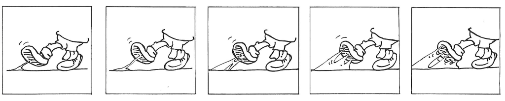
Chewiness Scale (also Caramel/Toffee intensity)
This Caramel/Toffee scale has doubled for Chewiness and this piece of design inspiration has worked well as a Stickiness scale. In this area, scales tend to “really work well” or “really bomb out”.
Stickiness Scale
However, this scale really never worked.
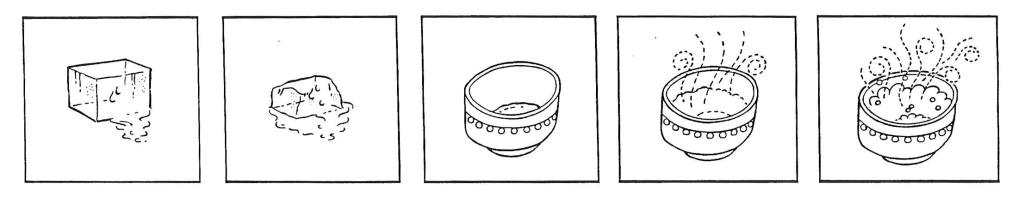
Cooling/Heating Scale (for Menthol)
It was developed to measure the heating-cooling effect of menthol in a toothpaste and the kids looked as blank as you are feeling reading this. I am sure that an effective scale could be developed, but for me it was a failure I had to accept and move on to the next product test.
Traditionally, packaging for food product needs to have “appetite appeal” – something which takes it from the shelf and into the trolley. Some design companies like the “sketch” approach to pack design, indicating a “homemade” quality to the product. While this can work in some niche premium categories, I have watched it fail in many of the larger, mass product categories. We can decry consumers as “artistic clods” but if we get too clever for them, they just don’t purchase. The pack is not seen as appealing or appetizing and the product fails.
Appetite appeal may take different forms depending on the category. It may be indications of an “interesting, stimulating flavour” with some healthy overtones in a specially herbal tea category or it may have strong connotations of health and well-being in a nutritional supplement. It is not necessarily appropriate to make the product look “yummy” in all categories. The appeal has to be relevant to the consumer and the category.
Where budgets do not allow for a high quality photographic approach to represent the product, it may be better to convey the qualities of the product through colour and typeface. You will also need to consider the print medium of your packaging and the constraints which that puts on the design. This will affect both the design size/format and the quality of printing which can be achieved.
Markets have become more and more fragmented, so keeping our visual communication consistent, focused and appropriate is even more important. Visually, the customer is bombarded with colours, images, impressions of your companies and your services.
We should never forget that we are trying to keep pace and communicate with an increasingly demanding and often fickle customer. It becomes increasingly hard to keep pace, particularly when we continue to place a lot of reliance on research methods which have been around for the last 60+ years. While we continue to do this, it is likely that our understanding of our customers will steadily slip further and further backwards. These research methods may have been appropriate to a slower pace of life and a customer who was less frazzled and beset by a variety of media stimuli. In an increasingly frenetic world of every diminishing development timelines, they are becoming increasingly irrelevant.
We also need to keep in mind the stimuli which are around our average consumer on a daily basis. All our customers have highly sophisticated inputs through their smartphones, electronic devices, social media, television, film and the press. So how do we convey new design concepts to them? Often we use quite primitive and boring means. So they aren’t excited by a new concept? So is it the concept or the expression of the concept? It is current dogma that a customer will never understand or find relevance in a truly breakthrough concept or product. Maybe that is true, but I tend to believe that the fault lies more with the inability of research to communicate the experience of a new concept and how it fits with our customer’s lifestyle. Research needs to begin using the technologies available through multimedia and virtual reality to help our customers experience new products and services.
Certain colours have strong associations within cultures. In many Western cultures, black is associated with death. Traditionally, it was seen as an inappropriate colour for packaging food – “Eat this and die!” Time has moved on and black (particularly with some metallic colours) is seen as a sign of luxury and high quality (think of chocolate and other luxury foods packaged in this way).
Years ago, New Zealand marketed butter in parchment (white) wrapping. White is associated with death in many Asian countries and no, it was not appropriate for consumers within some markets. The rules are no longer “black and white” and in many markets consumers will accept a much wider range of colour options as acceptable in product packaging. Still, If you are marketing overseas, it pays to check these associations with your potential consumers. You do want them to pick up your pack from the shelf!
Over the years, I have watched consumers choose colours they think would be appropriate for a particular pack design. Sometimes their choices are a complete surprise. One project was searching for design inputs for a milk substitute pack. It had previously been sold directly from the company in a white, clinical pack. Before launching in the supermarkets, the company was checking that this was the most appropriate colour. Consumers came up with a fresh, spring green, a soft mauve and a deep purple – they saw the product as something special for them alone. The final pack was an impressionistic mix of these colours with a soft, spring-like feel to it.
For those of you who know the Colour Wheel and how it is divided, consumers stick mainly to primary and secondary colours when it comes to food packaging. They see those colours as the colours of nature. These are the colours they consider “fresh” and “appetising”. The tertiary shades are not strongly associated with food. These are the fashion shades and, in general, fit better with personal care products.
Want to know more about my thoughts on colour and visual research? Click here
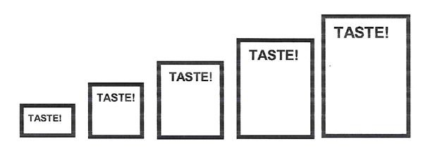
So if you want to use picture scales with children, how are you going to show intensity of a flavour? Visually, you have at least a couple of choices. You can make things BIGGER or show MORE of them.
If you are trying to get information about overall flavour intensity (= total flavour impact), I tend to use the bigger approach.
Taste Intensity Scale (Flavour Impact)
How much taste does this product have? The child may not be able to read the word but with interviewer assistance and clear visual differences among categories, it gives useful data.
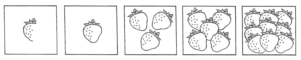
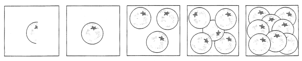
I use the MORE option when I want to get some idea of flavours within the product (not just overall impact) and there are many ways to do that – here are a couple I have used.
Strawberry Flavour ScaleOrange Flavour Scale
These scales give broad separation of products rather than fine distinctions but can be helpful in directing further refinements to a product.
So how do you get the best return on the dollars you invest in your packaging design? The answers are really self-evident. This is not rocket science.
Make sure that your pack design is focused in on your target audience to ensure that the “takeout” from the pack is appropriate.
If your budget is limited, spend your research dollars up front before your packaging direction is totally set. It is often the most difficult time to get approval for budgets (the closer you are to launching a new product or service, the more willing companies are to spend money). If you can ensure the direction is the correct one, you can make a judgement call on the final concept or design (if necessary). Spending all your budget on “assessing” a creative direction is often a great waste of money. It doesn’t assist the design team and is usually too late in the process. Nice to do it if you have the budget but it should only be a confirmation of a direction which is already correct.
Your pack may be the most tangible sign to your customers of your brand. Don’t skimp on it. Unless you are notices in the marketplace, you won’t get buy in.
Never forget that a glossy exterior is no substitute for a substandard interior. Be sure that your company’s products back up the messages consumers take from your pack. Also be sure that the two parts of the whole “fit” together, that what you promise you also deliver.
Working with children to understand their reactions to new ideas and products is fun and challenging. Provided the task is engaging and interesting, they are highly responsive and give you amazing feedback.
However, there are a number of ethical and legal issues which you need to understand. Some of those issues vary from country to country, particularly differences in privacy laws and protection for children. If you are wondering about some of these issues, a document which is worth reading is the ASTM E229-13 Standard Guide for Sensory Evaluation of Products by Children and Minors (https://www.astm.org/Standards/E2299.htm) put out by Committee E18 on Sensory Evaluation.
In addition to looking at testing issues (with a strong focus on what you should consider in terms of a child’s cognitive development) this document looks at legal and safety issues you should think about. It is worth having a check list of these issues before you begin your research, to ensure you and your organisation have protected the children you are working with.
Beyond the research itself, you need to consider whether you want to use any quotes or clips showing the reactions of children to products or ideas. Many of us record interviews or group discussions for our own use, which is fine. However, if any of that material is to be used with a wider audience, either within your organisation or outside, it needs to used carefully and with parental permission. One approach some companies use is to take any quotes or clips and have a child actor portray the original child participant.
If you were wondering – which matters more the colour or the words? Well certainly in terms of straight recognition (once the message has been digested, understood and accepted) the colour is the main visual cue customers look for. If you communicate your image in a way which stands out from your competitors – you will always have high recognition.
I think a good example of a colour/logo combination which was always easily recognised was the logo used in New Zealand in the mid 1980’s by The National Bank (actually the logo of the Lloyds Banking Group to which The National Bank belonged at that time).
Most of us associated “black horse” and “green” with The National Bank name and there was a surprisingly clear picture in our minds of the colours involved. They were simple, bold and timeless in the sense that they were not colours which dated or could be assigned to a particular era (unlike the famed pink and grey combinations which design teams seemed so fond of in the early and mid 1980’s).